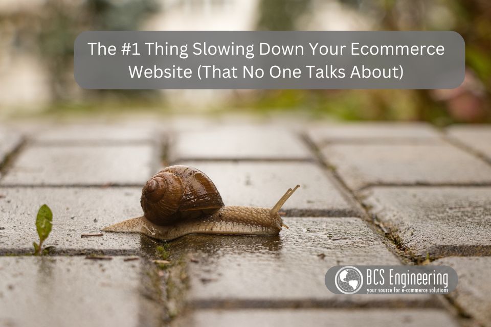
Category Archives: Ecommerce

Why Working Harder Is Not Helping Your Business Grow

Most business owners are no strangers to hard work. Long hours, packed schedules, and constant problem-solving often feel like the only way to move a business forward.

But here is the reality many entrepreneurs eventually run into:
Working harder does not always lead to growth.
In fact, it can create bottlenecks that slow things down.

Why Working Harder Is Not Helping Your Business Grow

When Hard Work Stops Being Effective

Hard work is essential in the early stages. You are building systems, developing processes, and figuring things out as you go. But over time, the workload increases faster than the capacity you have to handle it.

That is when many business owners unintentionally fall back on the only strategy they know. They push more. They take on even more tasks. They try to become more productive, more organized, and more disciplined.

The problem is not effort.
The problem is that effort alone cannot support long-term growth.

The Busy-But-Stalled Pattern

A lot of entrepreneurs end up here:

  • You are handling a steady stream of tasks
  • You are constantly working
  • You are staying productive
  • But the business is not moving forward in the way you expected

This is a sign that your productivity is focused in the wrong direction. You are keeping the business running instead of helping it grow. Important tasks get completed, but strategic work gets pushed to the background.

Why More Productivity Does Not Equal More Growth

Working harder becomes less effective for several reasons:

  • Your daily responsibilities increase, leaving little room for planning
  • Routine tasks consume time needed for improvements
  • You stay focused on execution instead of development
  • You operate in maintenance mode rather than growth mode

When every day is packed with tasks, there is very little room left for thinking about bigger opportunities, new services, customer experience improvements, or long-term planning. Growth requires space to evaluate, adjust, and make data-driven decisions.

What Actually Helps a Business Grow

Growth comes from clarity, focus, and intentional effort. It comes from identifying the few activities that truly move the business forward and making sure they get consistent attention.

This might look like:

  • Streamlining or automating tasks that consume too much time
  • Improving processes so the business runs smoothly without constant oversight
  • Prioritizing the work that has a direct impact on revenue or customer satisfaction
  • Creating systems that support long-term goals

It is not about doing more. It is about understanding what matters most.

If you find yourself working harder than ever but not seeing the results you want, it may be time to take a closer look at whether your productivity habits are actually helping your business grow.

Next Step: Learn How to Spot Productivity Habits That Slow Growth

I sat down with productivity expert Julie Miller Davis on the Smarter Online Business podcast to break down the specific productivity patterns that can limit your business, and what to pay attention to as you grow.

👉 Listen to the episode here:
Is Productivity Slowing Your Business Growth Down?
https://www.smarteronlinebusiness.com/is-productivity-slowing-your-business-growth-down/

When to Upgrade Your Website Support from DIY to Pro

If you’ve ever found yourself spending a weekend Googling how to fix a plugin error or update your theme without breaking your site, you’re not alone.

Many business owners start out managing their own websites — and for good reason. In the early days, doing it yourself feels smart, scrappy, and cost-effective. But as your business grows, that same DIY approach can quietly become a liability.

So how do you know when it’s time to move from “I’ve got this” to “I need help”?
Here are some clear signs that it’s time to upgrade your website support from DIY to professional.

When to Upgrade Your Website Support from DIY to Pro

1. You’re spending more time fixing tech than growing your business

When you launched your website, managing updates or adding new content probably felt easy enough. But as you add tools, integrations, and plugins, small tasks start eating up hours.

If you catch yourself troubleshooting instead of strategizing, or putting off marketing projects because you’re afraid of breaking something, that’s a sign it’s time to hand things off.

Your time is your most valuable resource — and it’s best spent running your business, not running updates.

2. You’re always reacting instead of preventing

DIY website care often means waiting until something breaks to fix it. Professionals, on the other hand, focus on prevention — regular security updates, plugin monitoring, backups, and performance checks.

If you’ve dealt with mysterious downtime, slow load speeds, or a broken checkout, you’ve already experienced how expensive “wait and see” can be.

When you upgrade to professional support, those problems are handled before they ever hit your radar.

3. You’re unsure who to call when something goes wrong

For many DIY website owners, help comes from “a guy who used to help with tech” or a freelancer found on a job board. But if something serious happens — like a hack, a broken plugin, or a hosting issue — who’s responsible?

A professional support partner provides not just tech fixes, but accountability. They manage your hosting environment, backups, and security layers as part of a clear system — so you’re never left guessing.

4. You want your website to do more

At some point, your site stops being a simple brochure and becomes a business engine — driving sales, building your email list, and supporting your marketing funnel.

That shift requires more than just maintenance; it needs strategy. A professional team can help you align your site’s performance, design, and SEO so it actually works for you, not just exists online.

5. You’re ready for peace of mind

The biggest benefit of upgrading your website support isn’t just technical — it’s emotional.

When you know your site is secure, your data is backed up, and your systems are running smoothly, you get to stop worrying about “what if” and start focusing on “what’s next.”

That peace of mind isn’t a luxury — it’s a business advantage.

Thinking About Getting Website Help? Here’s What to Watch Out For

Before you hand over your website to anyone, it’s important to know what makes a good website support partner — and what red flags to avoid. The truth is, not all tech help is created equal, and the wrong fit can cost you time, money, and peace of mind.

Tune in to our latest Smarter Online Business Podcast episode “What to Know Before You Hand Over the Keys to Your Website” for a behind-the-scenes look at what really happens when you outsource your website. You’ll learn how to choose a trustworthy partner, what questions to ask before you say yes, and how to protect your site, your data, and your business reputation in the process.

How to Create a Brand That Grows With You

When you’re first building your business, creating your brand can feel like a huge, mysterious task. What colors should you use? What should your logo look like? How do you make sure people actually understand what you do?

The truth is, your brand isn’t just your visuals—it’s the feeling people get when they interact with your business. It’s the promise you make and how consistently you deliver on it. Let’s break down how to create a brand that fits who you are today and still leaves room to grow tomorrow.

How to Create a Brand That Grows With You

1. Start With Your Purpose

Before you pick a color palette or design a logo, start with why your business exists.

Ask yourself:

  • What problem am I solving?
  • Who am I passionate about helping?
  • What impact do I want to make?

Your purpose sets the tone for every part of your brand. It’s the foundation of your message, your visuals, and your marketing.

2. Get Clear on Your Ideal Audience

You can’t create a brand that connects if you don’t know who you’re trying to reach.

Define your ideal customer by asking:

  • What are their biggest challenges or goals?
  • What words do they use to describe their situation?
  • How do they want to feel after working with you?

When you understand your audience deeply, your messaging becomes clearer and your visuals feel intentional—not random.

3. Define Your Core Message

Your message is how you communicate your purpose to your audience.
It’s what you want people to think and feel after seeing your website, your emails, or your social posts.

Start simple:

  • What do you do?
  • Who do you do it for?
  • Why does it matter?

Then, repeat that message consistently across all platforms. A clear message builds trust and helps potential customers know they’re in the right place.

4. Choose Visuals That Reflect Your Message

Now comes the fun part—colors, fonts, and imagery. But instead of choosing what looks trendy, choose what feels like your business.

If your brand is calm and professional, your visuals should reflect that. If it’s bold and energetic, lean into that vibe.

Your visuals are your first impression, so make sure they’re in harmony with your message and purpose.

5. Create a Brand Experience

Your brand lives in every touchpoint—your website, your social posts, your customer emails, and even how you handle support.

Ask yourself:

  • What experience do I want customers to have?
  • How can I make that experience consistent from start to finish?

When your audience knows what to expect from you, they start to trust you—and that’s the foundation of growth.

Your Brand Will Grow as You Do

Creating a brand isn’t about perfection. It’s about clarity, connection, and consistency. And here’s something many business owners forget: your brand isn’t meant to stay the same forever.

As your business grows, so do you. Your offers shift, your ideal customers become clearer, and your confidence in your message deepens. It’s completely normal for your brand to evolve along with those changes. What worked when you first started may no longer reflect where you are—or where you’re headed.

That evolution doesn’t mean you got it wrong the first time. It means you’ve grown.

If you’re starting to feel like your visuals, messaging, or overall presence don’t quite fit anymore, it might be time to explore what’s next.

🎧 Listen to this episode of the eCommerce Made Easy Podcast:
👉 Top 3 Signs You’re Ready for a Rebrand

In it, I walk you through the most common signs that your current brand might be holding you back—and what steps to take if you’re ready for your next stage of growth.

Your Homepage Might Look Great — But Does It Guide Anyone?

A stunning website can impress visitors at first glance, but looks alone won’t move them to take action. You can have a sleek design, polished brand colors, and beautiful images, yet still lose potential clients within seconds. Why? Because while your homepage looks great, it might not be guiding anyone where they need to go.

Your Homepage Might Look Great — But Does It Guide Anyone?

Pretty Doesn’t Mean Purposeful

Think of your homepage as the front door to your business. If someone walks in and doesn’t know where to go next, they’ll turn around and leave — not because they didn’t like what they saw, but because they didn’t know what to do.

A homepage that converts visitors into leads or customers has a clear purpose: it leads them somewhere. That might mean to your services page, a booking form, a free resource, or a featured product — but it’s always intentional.

Clarity Creates Confidence

Every element on your homepage should work together to tell a visitor, “You’re in the right place — and here’s your next step.”
That means:

  • A headline that immediately communicates what you do and who you help
  • A simple navigation that’s easy to follow
  • Buttons and calls-to-action that clearly show where to go next
  • Copy that connects emotionally and reduces hesitation

When visitors feel confident they’re in the right spot, they’re far more likely to keep exploring and eventually say yes to working with you.

Design with Direction

If you’re unsure whether your homepage is actually guiding your visitors, take a look at it through a fresh lens. Imagine landing there for the first time:

  • Do you know what to do within 5 seconds?
  • Is there a visible path that moves you from curiosity to action?
  • Does each section naturally lead to the next?

If the answers aren’t clear, it’s time to revisit your homepage strategy. The goal isn’t just to look good — it’s to lead effectively.

Want to Learn How to Turn Visitors into “Heck Yes” Clients?

Check out our latest episode of the Smarter Online Business podcast:
👉 How to Guide Visitors from Hello to Heck Yes

In this episode, we walk through how to map out your visitor’s journey and design a site that doesn’t just attract attention — it guides people confidently from their first hello all the way to a “heck yes.”

The First Impression That Makes or Breaks Your Online Business 

When someone lands on your website, you have just a few seconds to make an impression. In that short window, visitors decide whether to stay, explore, and potentially buy — or to click away and never return. 

Your homepage plays a crucial role in that decision. It’s your virtual storefront, your first handshake, and your chance to show potential customers that you understand what they need and can deliver it. 

So how do you make that first impression count? 

The First Impression That Makes or Breaks Your Online Business

1. Clarity Is Everything 

If visitors can’t quickly understand what you do and who you help, they won’t stick around to figure it out. 
A clear headline and supporting subtext should tell your story within seconds. Avoid industry jargon and clever phrases that make people think too hard. 

Ask yourself: 

  • Can a brand-new visitor tell what my business offers within 5 seconds? 
  • Is my primary call-to-action visible right away? 

If the answer is “not sure,” it’s time to simplify. 

2. Design with Intention 

A clean, well-organized homepage builds trust. Clutter, outdated visuals, or mismatched fonts can subconsciously signal that your business isn’t professional or up-to-date. 

Think of your homepage design like a storefront display — it should invite people in, not overwhelm them. 
Use plenty of white space, high-quality images, and consistent branding to create an experience that feels calm and confident. 

3. Speak to Your Ideal Client 

Your homepage isn’t just about showcasing your business — it’s about connecting with the right audience. 

Too often, websites are written for everyone, which means they don’t truly speak to anyone. Your homepage should highlight your ideal customer’s challenges and clearly show how your solution helps. 

When visitors feel seen and understood, they’re far more likely to take action. 

4. Guide the Journey 

Don’t make people guess what to do next. Every great homepage has a clear path for visitors to follow — whether that’s learning more, booking a call, or making a purchase. 

Your calls-to-action (CTAs) should be clear, concise, and consistent. Think of them as friendly signposts that help your visitors get where they want to go. 

5. The Power of a Strong First Impression 

Your homepage sets the tone for everything that follows. When it’s clear, trustworthy, and aligned with your ideal clients, it becomes one of your strongest conversion tools. 

But when it’s cluttered, confusing, or off-message? You could be quietly repelling the very clients you want to attract. 

Curious whether your homepage is attracting dream clients or quietly turning them away?
Tune in to the latest Smarter Online Business podcast episode, Homepage Mistakes That Are Quietly Repelling Your Best Clients,” and discover the subtle design and messaging missteps that could be costing you customers.

Is Your Website Helping or Hurting Your Business Growth? 

Your website is often the first impression potential customers have of your business. It’s where they decide whether you’re credible, professional, and capable of solving their problem. But here’s the truth, many business owners are unknowingly holding their growth back because their website isn’t set up to help their visitors move forward. 

If your website isn’t generating leads, sales, or inquiries like it should, it’s time to ask: is your website helping or hurting your business growth? 

The Role Your Website Plays in Business Growth 

Your website isn’t just a digital brochure. It’s a living, breathing part of your business that should support your goals. 
When built strategically, your website can: 

  • Attract the right audience 
  • Build trust and credibility 
  • Guide visitors toward taking action 
  • Convert browsers into buyers 

But when it’s not set up correctly, it can do the opposite, causing confusion, frustration, and lost opportunities. 

Signs Your Website Might Be Holding You Back 

If you’re seeing any of these signs, your website may be working against you: 

  • Visitors leave after viewing just one page 
  • You get traffic but few inquiries or sales 
  • People tell you they “couldn’t find” something on your site 
  • Your bounce rate is high or your engagement time is low 
  • You’re not sure visitors know where to go next 

These are all indicators that your website isn’t doing its job effectively, and one of the biggest culprits is often navigation

Why Navigation Matters More Than You Think 

Even the most beautiful website can frustrate users if they can’t easily find what they need. 
When visitors land on your site, they make split-second decisions. If your navigation isn’t intuitive, clear, and structured to support their goals, they’ll leave before ever learning what you have to offer. 

Your navigation determines how easily users can: 

  • Find key information 
  • Understand what you do 
  • Move closer to taking action 

A confusing menu or poor layout can quietly sabotage your results. 

Time to Evaluate Your Website’s Navigation 

If you’re serious about improving your website’s performance, start by looking at your navigation. Ask yourself: 

  • Is it clear what my business offers from the first click? 
  • Can users easily find what they’re looking for? 
  • Are my most important pages easy to access? 

These questions can reveal whether your website is supporting your growth, or stalling it. 

Ready to Learn Which Navigation Elements Matter Most? 

Not all navigation features are created equal. Some can improve user experience, while others can make it harder for visitors to take action. 

In my podcast episode, “The Three Navigation Elements That Can Make or Break Your Website,” I break down which navigation components truly impact your site’s performance and how to get them right. 

Listen in to make sure your website is helping your business grow, not holding it back. 

When Your Voice Becomes Your Competitive Edge

In today’s crowded online space, your audience isn’t just buying your products or services — they’re buying you.

Your tone, your stories, and the way you communicate all shape how people perceive your brand. That unique “voice” becomes your superpower in a world filled with look-alike offers and generic marketing messages.

When Your Voice Becomes Your Competitive Edge

Why Voice Matters More Than Ever

Think about the businesses you love to follow online. Chances are, you can instantly recognize their content — even without seeing the logo. That’s because their voice sets them apart.

A clear, consistent voice builds trust. It makes people feel like they know you, even before they buy from you. And when your audience trusts you, your marketing suddenly starts feeling less like selling and more like connecting.

The Trap of Sounding Like Everyone Else

When business owners sit down to write content, it’s easy to slip into “professional mode.” The result? Stiff, safe, and overly polished copy that could have come from anyone.

Here’s the truth: trying to sound like everyone else doesn’t make you sound more credible — it makes you forgettable.

Your ideal clients are craving realness. They want to hear you — your quirks, your energy, your perspective. That’s what helps them decide, “Yes, this is who I want to work with.”

How to Start Finding (or Refining) Your Voice

If you’re not sure what your voice sounds like yet, here are a few places to start:

  • Listen to your natural tone. How do you talk to clients or friends? Start writing like that.
  • Read your content out loud. If it feels awkward to say, it probably doesn’t sound like you.
  • Ask for feedback. Sometimes others can hear your voice more clearly than you can.
  • Embrace imperfection. Your voice will evolve as you grow. The key is to start using it now.

The more consistently you write and speak from your authentic voice, the more your content starts to click — with you and with your audience.

Your Voice Is the Key to Connection

Your voice isn’t just a marketing tool; it’s your bridge to real human connection. When you stop worrying about what’s “right” and focus on what’s real, you’ll find that your message lands more powerfully than ever before.

Want to Hear More About Finding Your Voice?

If you’ve ever sat staring at a blinking cursor wondering what to say or how to say it, this week’s podcast episode is for you.

🎙️ Listen to “Finding Your Voice: From Blinking Cursor to Compelling Copy” to learn how to move past hesitation and bring your authentic voice into every piece of content you create.

👉 Click here to listen now!

Why Your Website Loses Visitors in the First 8 Seconds (and How to Stop It) 

We live in an era of short attention spans. When someone lands on your website, you don’t get minutes to make your case—you get seconds. In fact, most studies show that you have about 8 seconds (or less) to capture attention before a visitor decides whether to stay or click away. 

That means your homepage, your headlines, and even your first line of copy have a massive job to do. If your site isn’t clear, fast, and easy to understand right away, you’re losing people who could have become customers. 

So what’s happening in those first crucial moments? 

Why Your Website Loses Visitors in the First 8 Seconds (and How to Stop It)

The “Blink Test” of Websites 

Think of your website like a first impression. Just as you make snap judgments about people, visitors make instant judgments about your site. They quickly decide if: 

  • They’re in the right place 
  • You offer what they’re looking for 
  • It feels trustworthy and worth their time 

If the answer isn’t obvious in those first few seconds, they’ll move on to the next option—often a competitor’s site. 

Common Reasons Visitors Leave Too Soon 

Here are some of the biggest culprits behind early exits: 

  1. Slow load time – If your site takes more than a couple of seconds to load, most visitors won’t wait around. 
  1. Cluttered layout – Too much text, competing images, or busy designs overwhelm the eye. 
  1. Unclear value proposition – If your headline doesn’t instantly communicate what you do and why it matters, you lose them. 
  1. Weak visual hierarchy – Visitors don’t know where to look first, so they give up. 
  1. Hard-to-find CTA – If the next step isn’t obvious, people won’t take it. 

How to Win Back Those 8 Seconds 

The good news is, small changes can make a huge impact. Focus on: 

  • Clarity first: Your headline should tell visitors exactly what you do in plain language. 
  • Speed: Optimize images and hosting so your pages load quickly. 
  • Visual flow: Use whitespace, strong subheadings, and clear CTAs to guide the eye. 
  • Mobile-first design: Most people visit from their phones—make sure your site is thumb-friendly. 

These improvements can help you pass that 8-second test and keep visitors engaged long enough to explore what you offer. 

Want to Go Deeper? 

These strategies are just the beginning. If you want to learn exactly how to design a website that captures attention fast (and holds it), I dive deeper into the process in my podcast episode: 

🎧 Designing a Website That Works for Short Attention Spans 

Listen in to discover the exact design tweaks and messaging strategies that can turn fleeting visitors into engaged customers. 

Why a Confusing Website Costs You More Than You Think

When business owners think about their websites, they often focus on how it looks. While design matters, what matters even more is clarity. A confusing website doesn’t just frustrate visitors — it can cost you real money in missed sales, wasted ad spend, and lost trust.

The truth is, your website should be working for you 24/7 as a sales tool. If it’s not structured clearly, it can actually work against you. Let’s break down the hidden costs of a poorly structured website and why investing in clarity pays off.

Why a Confusing Website Costs You More Than You Think

Lost Sales Opportunities

Most visitors spend only a few seconds deciding whether to stay on your site or click away. If they can’t quickly figure out:

  • What you do
  • Who you help
  • How to take the next step

they’re gone. That means missed opportunities and lost revenue — not because your product or service isn’t good, but because your website failed to guide them.

Wasted Marketing Dollars

Think about all the energy and money you put into driving traffic: social media posts, email campaigns, ads, networking. All of it leads back to your website.

But here’s the catch: if that traffic lands on a site that’s cluttered or confusing, those visitors won’t convert. That means every dollar spent on ads or hours invested in content creation has less return. Instead of building momentum, you’re pouring resources into a leaky bucket.

Damaged Credibility

Your website is often the very first interaction someone has with your business. If it feels disorganized, overwhelming, or hard to navigate, visitors may assume your business is the same way.

Credibility is key to trust, and trust is key to sales. A confusing website can create doubt in a potential customer’s mind before you ever get the chance to prove your value. On the flip side, a clear, well-structured site immediately builds confidence in your professionalism.

Stalled Business Growth

A confusing website doesn’t just hurt you in the moment — it slows your overall growth. Without a clear structure:

  • It’s harder to capture leads and build your email list
  • Your sales funnel gets clogged instead of flowing smoothly
  • You struggle to scale marketing because your foundation isn’t solid

It’s like trying to build a house on shaky ground. Even with the best materials (great products, amazing customer service), the foundation isn’t strong enough to support long-term growth.

The Power of Clarity

The good news is that clarity doesn’t mean starting from scratch or stripping away your brand personality. It’s about guiding visitors through a simple, intentional journey that leads to a decision.

A clear structure helps your website act like your best salesperson — available 24/7, building trust, and nudging people toward becoming paying customers.

And here’s the best part: when your website is clear and structured for sales, all your other marketing efforts start working better. Ads convert more, email campaigns get more sign-ups, and referrals feel more confident sending people your way.

Ready to Make Your Website Work for You?

The costs of a confusing website add up quickly, but the fix is simpler than you might think.

👉 Listen to this episode of the Smarter Online Business podcast to learn how to structure your website for sales — not confusion. In it, I’ll walk you through practical steps to transform your site into a tool that drives revenue and growth.

What Most Business Owners Miss When Designing Their Website

When designing a website, most entrepreneurs focus on the obvious things: making it look professional, ensuring the colors match their brand, and setting up a homepage that makes a good first impression.

But here’s the truth — great design alone doesn’t guarantee a website that works. The most successful websites are the ones that balance design with strategy. And that’s where many business owners miss the mark.

What Most Business Owners Miss When Designing Their Website

1. Forgetting About the Customer Journey

It’s easy to get caught up in what you want people to see first. But have you thought about the path your visitors naturally take?

  • Do they know what you offer right away?
  • Is it clear what step they should take next?
  • Can they easily find answers to their questions?

If the journey isn’t clear, you risk losing them — no matter how polished the design is.

2. Ignoring Calls to Action (CTAs)

A beautiful website without direction is like a store without signs. You need to guide visitors toward the next step. Whether that’s joining your email list, booking a call, or purchasing a product, your site should clearly tell people what to do next.

Too many business owners bury their CTAs or don’t include them at all, missing a huge opportunity to convert casual visitors into loyal customers.

3. Not Building Trust Early Enough

People rarely buy from businesses they don’t trust. That’s why your website needs to show credibility upfront. Testimonials, case studies, or even a simple message that conveys your story can make a big difference.

Unfortunately, many business owners either skip this or hide it away in less-visited corners of their site.

4. Overlooking Content That Connects

Your website isn’t just about what you sell — it’s also about why you do it. When your copy speaks directly to your customer’s needs and challenges, you create a connection that design alone can’t achieve. Skipping this step leaves your site looking nice but feeling empty.

The Bonus Most People Miss

Even if you check all the boxes above, there’s still one page that often gets overlooked — and it can make or break your conversions.

I cover this page in detail on my Smarter Online Business podcast. Tune in to this episode: The Most Overlooked Page on Your Website (and Why It’s Hurting Conversions).

You’ll learn:

  • What the page is (you likely already have it)
  • Why it’s a powerful trust-builder
  • Simple tweaks to turn it into a conversion tool

If you’re serious about making your website do more than just “look good,” this episode is your next step.