Getting traffic to your website is only half the battle. The real question is this: when someone lands on your site, do they feel safe enough to take the next step?
Conversions don’t happen because you asked nicely or added another button. They happen when a visitor feels confident, understood, and reassured that they’re in the right place. In other words, conversion is a trust decision.
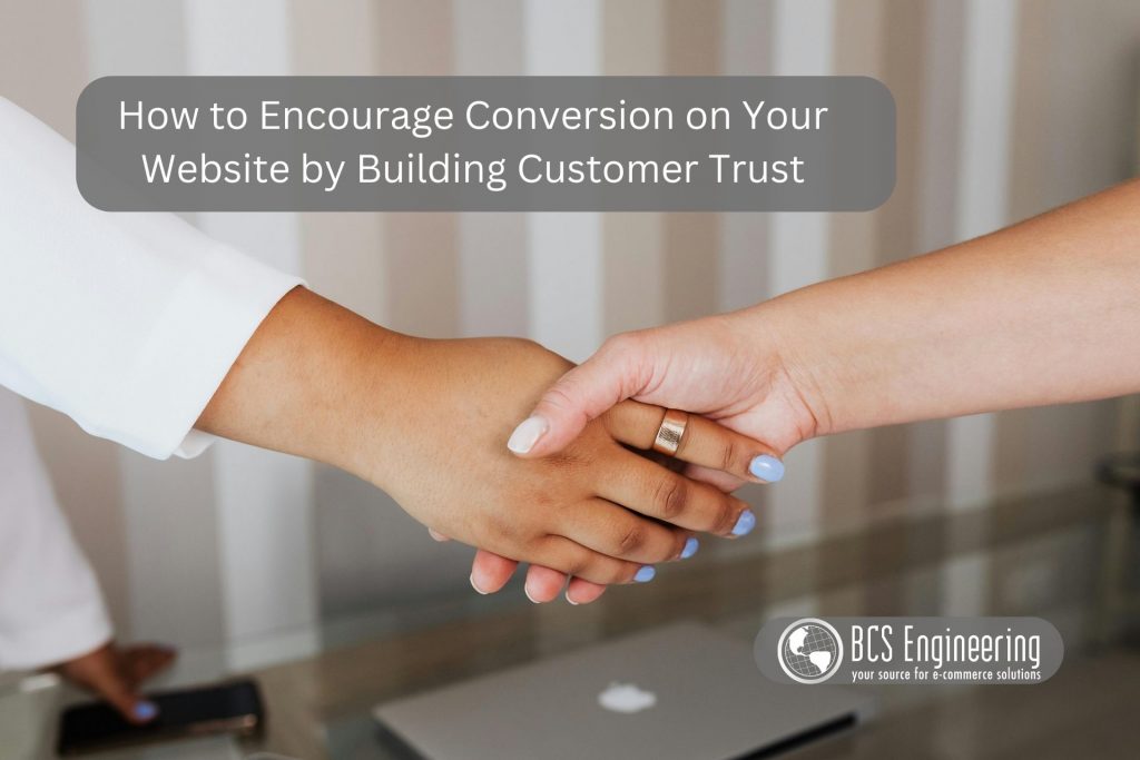
Here’s how to encourage more conversions on your website by intentionally building customer trust at every step.
Conversion Starts With Clarity
Before a visitor can trust you, they need to quickly understand what you do and who it’s for. Confusion creates hesitation, and hesitation kills conversion.
Within seconds of landing on your site, visitors should be able to answer:
- Who is this for?
- What problem does this solve?
- What should I do next?
Clear headlines, simple language, and focused messaging remove friction and make it easier for someone to stay instead of bounce.
Calls to Action Should Feel Safe, Not Pushy
A strong Call to Action is not about pressure. It’s about guidance.
When your CTA is clear, specific, and aligned with what the visitor already wants, it feels like a natural next step rather than a sales push.
Effective CTAs:
- Use clear, action-based language
- Match the intent of the page
- Reduce perceived risk with wording like “Get the free guide” or “Book a no-pressure call”
The goal is to help visitors feel confident clicking, not anxious about committing.
Social Proof Reduces Risk
One of the fastest ways to build trust is to show that other people have already gone first.
Testimonials, reviews, case studies, and recognizable logos help answer the unspoken question every visitor is asking: Has this worked for someone like me?
When visitors see real results from real people, the decision to convert feels less risky and more reasonable.
Simplicity Builds Confidence
Every extra step, field, or distraction introduces doubt.
Long forms, cluttered layouts, and too many choices make visitors second-guess themselves. A simple, focused experience tells users that you respect their time and understand their needs.
Ask only for what you need, keep layouts clean, and remove anything that doesn’t support the primary action on the page.
Trust Must Carry Through on Mobile
If your site looks polished on desktop but clunky on mobile, trust breaks instantly.
Buttons that are hard to tap, text that’s difficult to read, or forms that don’t function smoothly signal carelessness—even if your service is excellent.
A mobile-friendly experience shows professionalism and reliability, two key trust factors in conversion.
Visual Trust Signals Do the Heavy Lifting
Visitors don’t read first, they scan. That means visual trust signals often speak before your copy does.
Things like:
- Professional design
- Security badges
- Payment icons
- Guarantees or certifications
These elements quietly reassure visitors that your site is legitimate, secure, and worth engaging with. They help people feel safe enough to take action without overthinking it.
Conversion Is a Trust Journey, Not a Button Color
Encouraging conversion isn’t about tricks or hacks. It’s about reducing uncertainty at every step and making the next action feel obvious and safe.
When your website builds trust through clarity, consistency, and thoughtful design, conversion becomes a natural outcome—not something you have to force.
Want to Strengthen Trust on Your Website?
If you want to see how visual trust signals specifically influence buyer behavior and website conversions, listen to the podcast episode Using Visual Trust Signals to Increase Website Conversions.
🎧 Listen here: https://www.smarteronlinebusiness.com/using-visual-trust-signals-to-increase-website-conversions/
It breaks down exactly what visitors look for and how small visual changes can make a big difference in conversion.